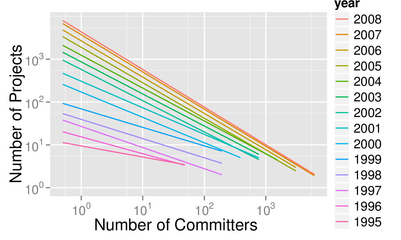
Open source is not only software, but also an approach to software development. The public nature of open source projects lets us show how open source software development scales to the largest project sizes. The following figure illustrates the scalability of open source software development. I call it the big bang of open source.

The figure shows the growth of active well-working open source projects of all sizes over time, as captured in our database [1]. Each line represents a particular year, from 1995 to 2008. Each line shows how many projects of a particular size existed in that given year. The x-axis shows the size of projects, and the y-axis shows the number of projects of that size. So, for 1995, we can see that there were 10 projects of size 1 committer. (The scales are logarithmic [2].) Using the number of registered committers as a proxy for a project’s size is most certainly a conservative assumption. In 1995, there were also 4 projects of size 10 committers. In 1996, there were already more smaller projects and also more larger projects.
As you can see, the number of smallest projects (one committer) kept growing over time and reached about 3.200 in 2008 in our sample. At the same time, some of these smallest projects kept growing, migrating to the right in the figure. In 2008, there were 10 projects of size 1.000 committers! (While in 1995 there were none.) I find this continued growth of open source intriguing. Speculating from the expansion of the year lines there is a constant supply of new projects, and each project grows to the size right for it, including some very large project sizes.
Mathematically, of interest is the gradient over the year lines. The gradient is the formula that captures the year-over-year growth. I call the figure an illustration of the open source big bang, because the gradient captures the expansion speed of the growing open source universe. We have not yet been able to develop an appropriate mathematical model for this apparent growth. However, the figure illustrates how open source projects consistently scale to the largest project sizes. We may not yet know exactly why, but we are measuring that they do.
If you liked this blog post, you might also like reading about
- Open source practices for internal software development (a.k.a. inner source)
- How to go to to market with an open source strategy
- The economic case for open source foundations
- My current presentations on open source
Footnotes and References
[1] The data used to generate the figure was taken from an Ohloh.net database snapshot from March 2008. That snapshot contains about 30% of all active open source projects at that time, using Carlo Daffara’s estimate of total population as well as activity. The year lines in the figure are not the result of precise mathematical modeling, rather they are a linear regression fitted into the logarithmic data. Thus, this figure serves eyeballing purposes only. The figure itself was created by my Ph.D. student Carsten Kolassa.
[2] A short reminder on logarithms, in case it got rusty: 10^0 = 1, 10^0.6 = 4 (roughly), 10^1 = 10, etc. The exponents are to be found on the x and y-axes.


Leave a Reply